Controversial First, Iconic Later
The design world has this weird blind spot and I've been trying to put my finger on it for a while. This actually started as a shower thought and turned into something I haven't stopped poking at.
Ever had a song grow on you? Like you heard it, thought it was ummm weird or just okay, maybe even skipped it a few times, and then weeks or even years later you're playing it on repeat and wondering why you didn't get it the first time. Well, design does that too, more often than we admit.
controversial /ˌkɒntrəˈvəːʃl/ : "relating to or causing much discussion, disagreement, or argument."
Which is basically a very polite way of saying: people weren't ready for it yet.
In 1971, Carolyn Davidson charged Nike $35 for a logo. Phil Knight said "I don't love it, but it'll grow on me." The Swoosh, which is arguably the most recognized logo on the planet, and yet the guy who commissioned it wasn't sure he even wanted to use it, lol.
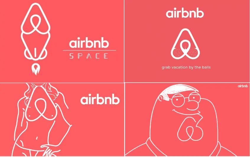
AirPods launched in 2016 and were immediately scorned as "expensive cigarette butts." The internet spent a whole week making jokes about the Airbnb Bélo. Dieter Rams' work at Braun was considered cold and antiseptic compared to the ornate stuff it replaced. The Nothing Phone showed up with a glyph interface that had people genuinely confused about whether it was a joke. Kanye's Yeezy Boost 350 dropped and sneakerheads called it ugly, too minimal, too beige, basically a sock with a sole. GQ eventually called it the "most influential sneaker" of its era and every major brand has a version of it now. The Yeezy fashion collections were wilder still, post-apocalyptic silhouettes, neutral tones, oversized everything, things that looked unfinished on purpose. Critics were baffled. The industry copied it within two seasons. I could go on and on.
The pattern is almost boring once you start noticing it. Controversial first, iconic later. Over and over and over again.
Phil Knight eventually grew into the Swoosh, by the way. And the world did too.
The Other Category
But here's where it gets interesting, because there's a whole other category of design that never makes it into this conversation.
The original Google homepage, had one box. At a time when every other search engine was cluttered with news, ads, links to things you didn't ask for. Larry Page nearly didn't ship it because it looked "unfinished." Go figure, it became the most used interface in human history and yet, nobody has a poster of it on their wall. The most successful interfaces are often the least memorable.
That's the paradox. The design we celebrate is usually the design that made people uncomfortable. The design that actually moves billions of people through the world? It's the stuff nobody notices. Because noticing it means it didn't work.
Two completely different games. And we're only throwing parties for one of them.
Designing for Real People
Okay, so here's where I have to be honest about my own situation because I live in this tension every single day.
I work in banking and fintech. And there is always, always a version of me that wants to push things further. To make something that doesn't look like every other fintech app with its pastel gradients and rounded cards and bottom sheet modals that we've all copied from each other at this point, haha. Like, the Nothing Phone but for fintech, utility and distinctive design all in one, something that actually has a personality - the temptation is REAL.
But then, I remember who I'm actually designing for.
Someone checking if their salary has landed, stressed about rent, opening the app for thirty seconds on a supermarket checkout line. That person doesn't care about design discourse. They just need it to work- right now, without confusion, without having to think.
For them, clever is a problem, uenexpected is friction. That micro interaction I spent two days on? They didn't notice it, but then, that's the goal. In fintech, trust is the whole product, and trust is boring by design. It's familiar, it uses patterns people already understand. You save the bolder moves for the moments that can actually hold them; empty states, onboarding, brand campaigns. But for the core flows? Those have to disappear.
Safe Design Isn't Laziness
And the last thing worth saying: safe design isn't laziness. Most of the time it's just a rational business decision.
Hear me out, let's assume you're a CPO. Rebrand proposal on the table. Option A is distinctive and unexpected and 'cool', the kind of thing that could get people talking. Option B is clean, familiar, something your customers will recognize without thinking. You've got a board, a customer base that hates surprises, and a support team that'll be fielding confused tickets for months if you get it wrong. 9 out of 10 times, you pick option B, not because you lack taste, but because you've done the math. If people are talking about your checkout flow, something has probably gone wrong.
Look at Jaguar's rebrand in 2024. They dropped their iconic leaping cat, went ultra-minimalist, completely overhauled the typography. The internet lost it, I lost it. Car enthusiasts said they'd destroyed a legacy. "What even is this?" was pretty much the universal reaction. We still don't fully know if it works, the jury is still out. But that discomfort, that "is this genius or a disaster?" feeling, is exactly what every bold design decision feels like before time gives you the answer. Safe design exists because most companies can't afford to wait for that answer. The downside of getting it wrong is immediate and visible, while the upside compounds slowly, usually long after the person who made the call has moved on to their next job.
Rational and memorable aren't the same thing. Familiarity is often the highest form of trust but we should probably stop acting like safe design is always a failure of nerve.
What I Keep Coming Back To
The reason controversial design ages into iconic is that it was optimized for somewhere slightly ahead of where we were, not for the person who exists right now with their current comfort levels and references. That's a scary bet. Most companies aren't structured to make it, most designers aren't even given the runway to try.
But it keeps happening. Discomfort first, reverence later. And then there's the invisible stuff, moving people through the world without friction, without anyone stopping to say "great design." The highest compliment it ever gets is that nobody noticed it at all.
Both things are hard, and they both matter. One gets the museum exhibitions, the other gets the job done.
HOWEVER, not every controversial design becomes iconic. Some of it is just bad, genuinely, irredeemably bad. The Swoosh grew on people because there was something worth growing into. Not every polarising design decision has that. Sometimes the internet is/was right, sometimes it really is just a terrible logo, a terrible product direction. The tricky part is that you usually can't tell the difference in the moment, and that's exactly what makes the bet so hard to take.
Now, say the Cybertruck. I still can't decide. Maybe in ten years it'll sit beside the Swoosh and AirPods in the long history of things people initially got wrong. Or maybe it'll become a case study in why controversy and quality aren't the same thing and that's the uncomfortable part, you don't get to know which one you're making while you're making it.
And I think that's the lesson.
Maybe that's why design is so difficult. You're usually choosing between two kinds of success. You can make something memorable, knowing people may hate it before they understand it, or you can make something invisible, knowing nobody will ever celebrate it.
And sometimes, if you're very lucky, the thing people eventually call iconic also becomes something they no longer have to think about.