Yellowcard Onboarding

Twenty markets, one sign-up. The hard part was deciding what a new customer should never have to tell us.
Try the prototypethe shipped flow in one pass: phone, identity, security, welcome. the market is read off the dialling code on the first step and only shows itself on the last.
What was wrong. Yellow Card signs people up in more than twenty African countries, each with its own language, currency and identity rules. The old flow gave all of them the same four screens in the same voice, asked for the country before anything else, and asked for the phone number so late that people who only wanted to log in were three steps deep before they found out.
Why it mattered. How do you make one onboarding feel local in more than twenty countries, without building twenty onboardings? The tempting answers were a flow per market, or one flow that pretends the markets are the same. The shipped answer was to move the branch: the system absorbs the differences, and the customer only sees the ones that are theirs.
What I designed. a single three-step flow in which the phone number carries the country, the country configures the account, and the only screen that changes by market is the welcome.
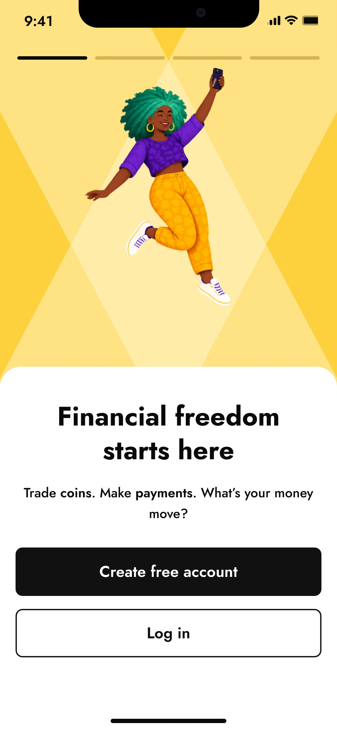
What it looked like. Three steps on white, where the earlier flow had four on yellow, and a welcome that knows where you are. At the end you can sign up from any market.
- role
- product designer. I owned the redesign: the research synthesis, the step order, what each step asks for and what it lets you skip, the password and help interactions, the move from yellow to white, and the localised welcome.
- team
- a product manager, mobile engineers on iOS and Android, a product illustrator I ran the colour workshop with, and compliance, who owned which fields each market legally requires. The market configuration behind the flow was engineering's.
- status
- shipped in the Yellow Card consumer app across all markets at once.
the problem, scope and signals, and what was not mine
- problem
- one sign-up for twenty-plus markets that felt built somewhere else, took too long, and asked questions in the wrong order.
- scope
- research synthesis · the three-step structure · phone-first and the dropped country step · required against optional · the password rules · contextual help · the white flow and new illustration · the market-specific welcome.
- not mine
- the KYC document capture that follows onboarding, the login flow, and the per-market compliance rules themselves were owned elsewhere and are out of scope here.
- signals
- time to complete down 23% and conversion up +4.4%, across all markets at once. what each number can and cannot say is defined below.
the old flow asked the wrong question first
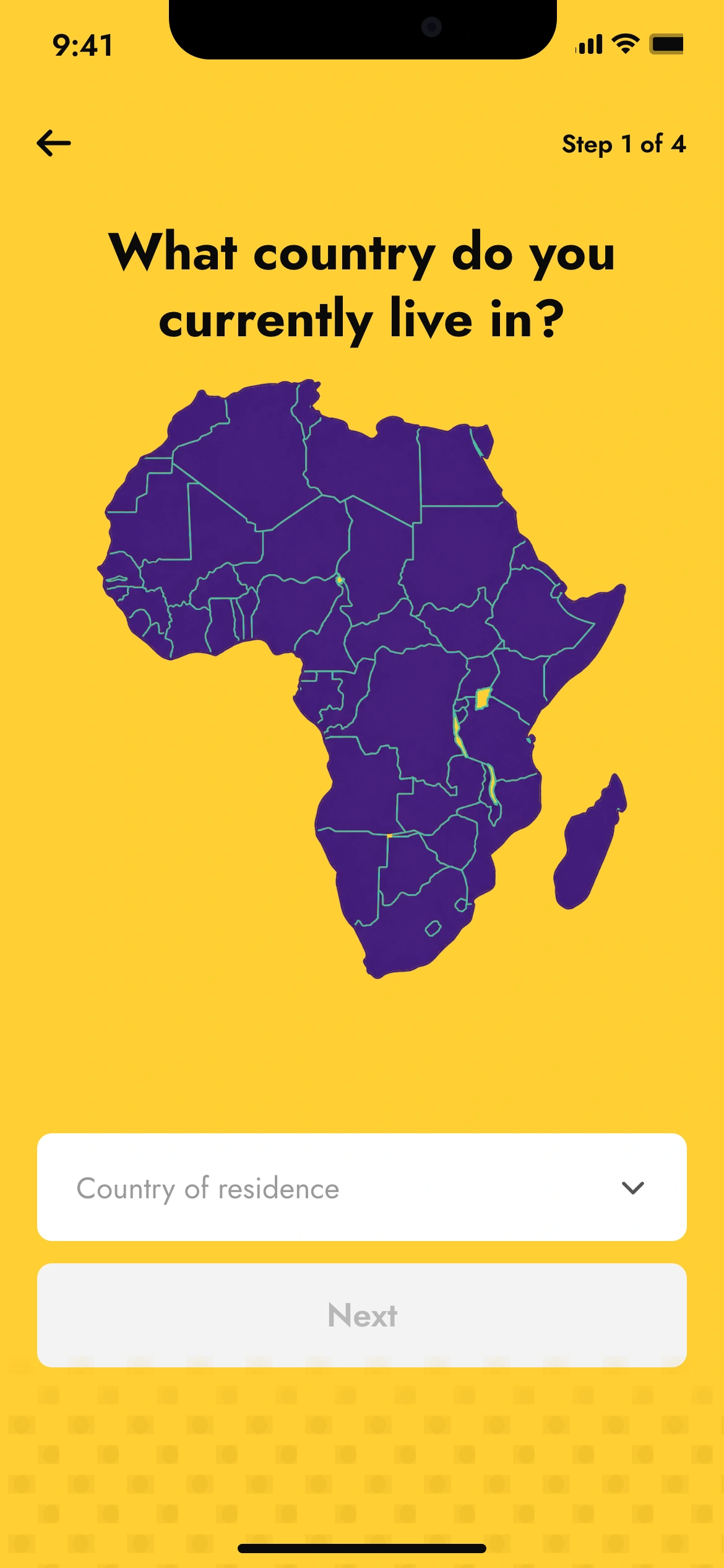
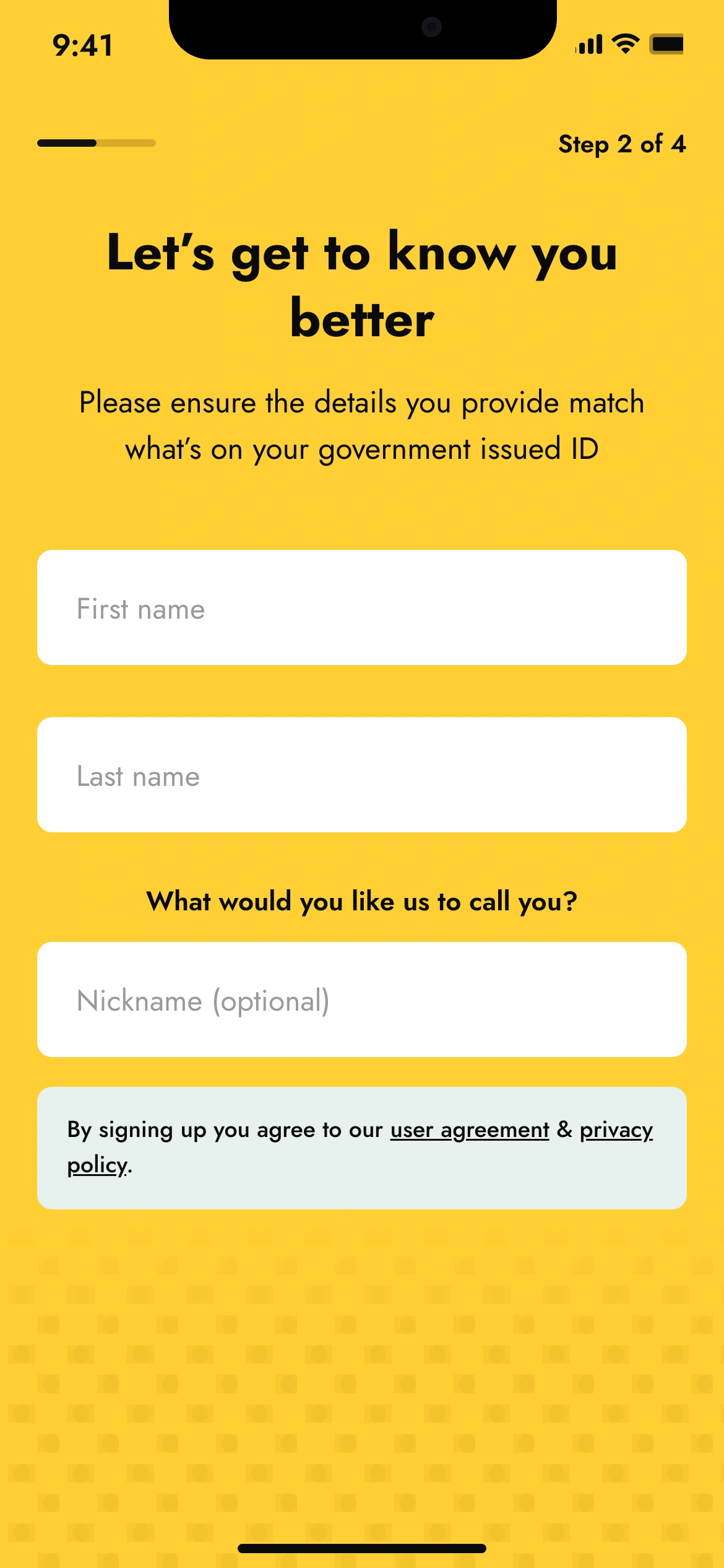
Four steps, on yellow. The first asked which country you live in, over a map of the continent. The second asked for your name. The phone number, which is what you actually log in with, came after that, so someone who already had an account and tapped the wrong button was two screens in before the flow told them so.
We ran usability sessions, a survey and a pass through support tickets before I changed anything. The findings repeated: the steps felt disconnected, the yellow made the forms hard to read, and customers in different markets said the product did not feel made for them. That last one is the one that set the direction. This was not only a shorter-flow problem.
the flow, before and after
before · 4 steps
- 01country of residencea map and a dropdown
- 02names and nickname
- 03date of birth and phone numberthe login credential, on the third screen
- 04password and email
after · 3 steps
- 01phone numberthe dialling code sets the market
- 02names, nickname, date of birthwhat has to match your ID, together
- 03password and emailhow you get in, and how you get back in
- →welcome, in your market’s words
the phone number already knows where you are
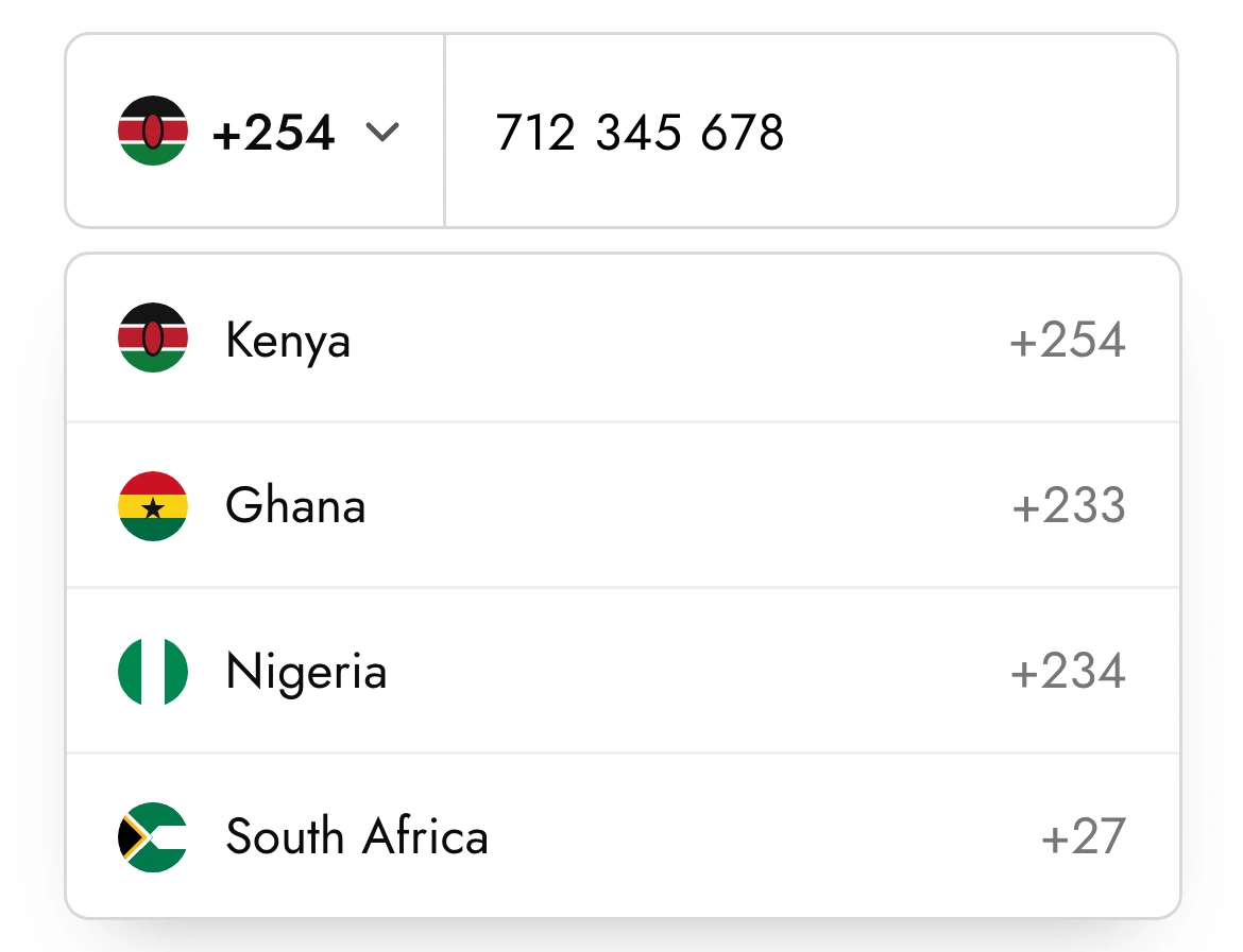
The first thing I moved was the phone number, to the front. It is the credential, so asking for it first catches the people who meant to log in before they have typed anything else. Then the country step became redundant: a Kenyan number starts with +254. The dialling code is the same fact the map screen was asking for, already typed.
So the country stopped being a question and became something the system reads. That took the flow from four steps to three, and it did something more important than saving a screen. It meant the market could configure the account, the currency, the welcome, without the customer having to know that any of it was configurable.
If the customer has already told us something, we do not ask again.
what blocks, and what can wait
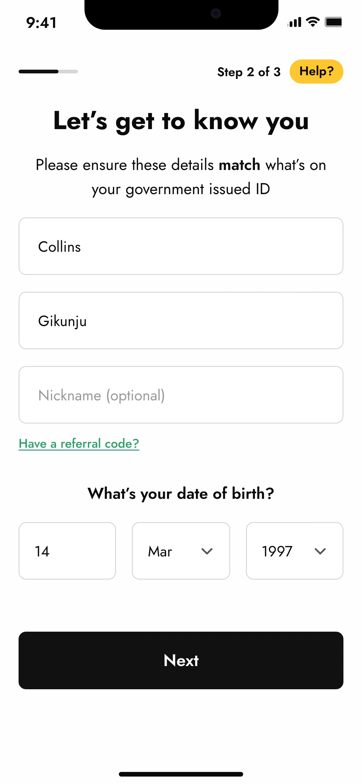
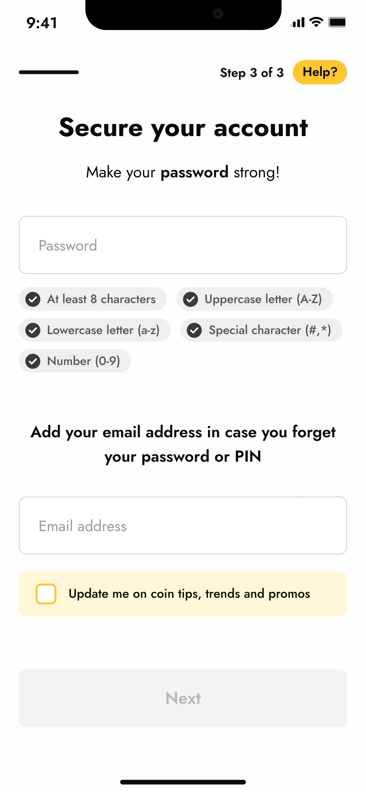
Fewer steps did not mean fewer fields. The shipped flow still asks for a nickname, a referral code, a marketing opt-in and a recovery email. What changed is which of them can stop you. Only the information needed to create a safe, valid account blocks Next: the name and date of birth that have to match an ID, a password that meets five rules, and an email, because a phone-number login needs a way back in.
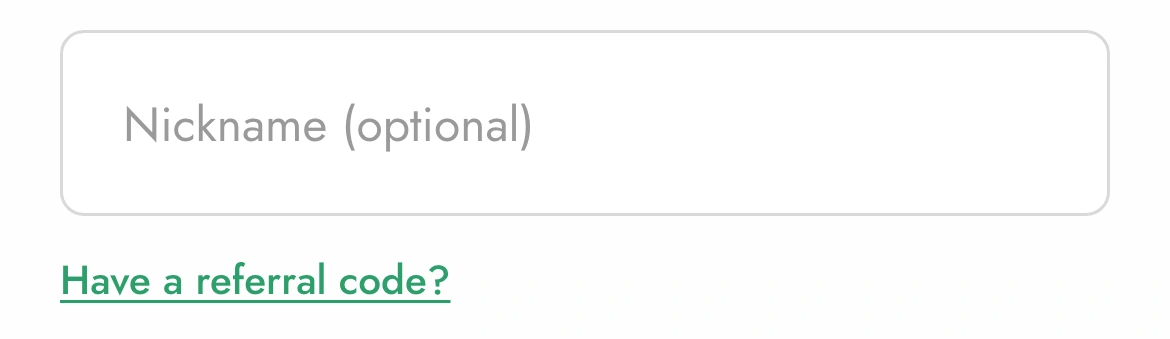
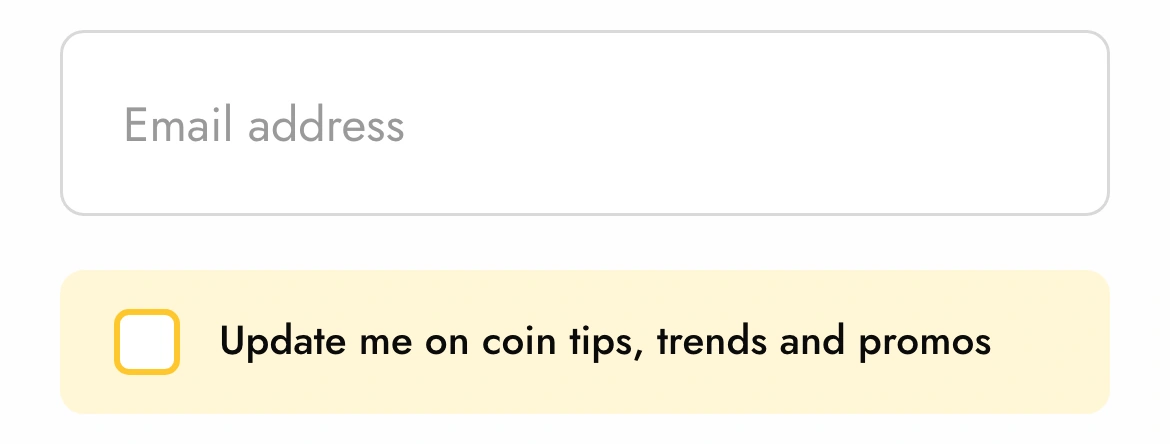
Everything else says what it is. The nickname says (optional) in the field. The referral code lives behind a link, so the field only exists for people who have one. The promo opt-in is a box, off by default, in a yellow strip that makes it clearly a choice. And the fields are grouped by why they exist: name with date of birth, password with email, so each screen asks one kind of question.
Account creation is blocked only by what is required to create a safe, valid account.
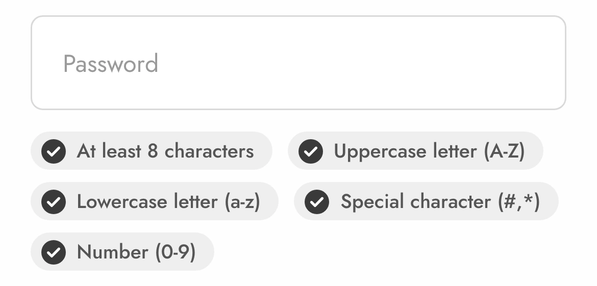
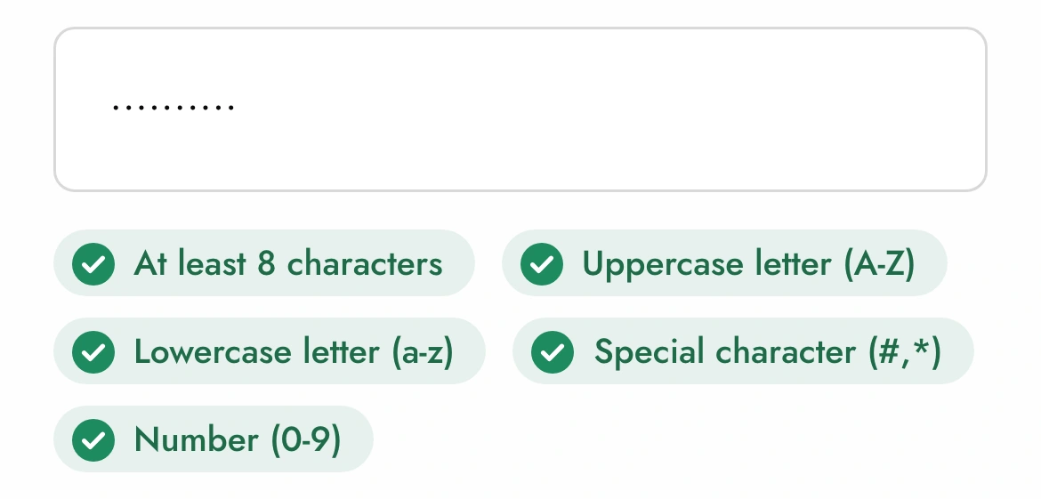
up close: the rules, before and after typing
up close: what is optional, and says so
the rules
open the rulesif, then, because
a piece of information can be derived from something the customer already gave
thenthe customer is not asked for it
becausethe country was a whole screen with a map. the dialling code is the same fact, already typed.
a field is not required to create a safe, valid account
thenit does not block Next, and it says so
becausenickname, referral code and marketing opt-in are all real product needs. none of them is a reason to stop someone opening an account.
two fields are needed for the same reason
thenthey share a screen
becausename and date of birth exist to match an ID. password and email exist to get back in. grouping by reason makes the ask feel obvious without a paragraph explaining it.
the flow has to differ by market
thenit differs at exactly one point, after the account exists
becausea branch at the start forks everything after it. a branch at the end forks nothing.
a customer opens help
thenit opens over the step and closes back to it with everything they typed still there
becausethe old flow's confusion came from steps that felt disconnected. leaving the flow to get help would bring that back.
help that keeps your place
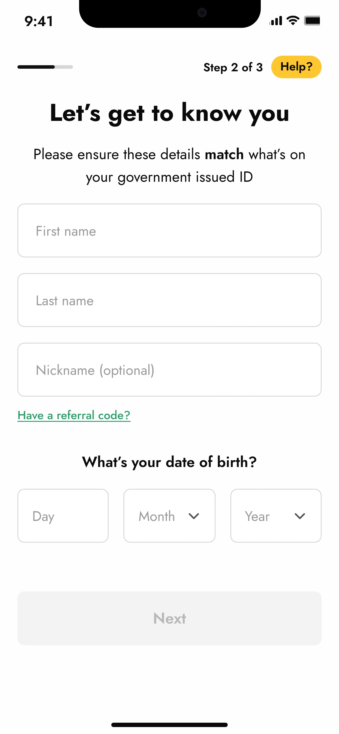
Every step has a Help? pill in the corner, next to the step count. The research said the old steps felt disconnected, and the fastest way to make a new flow feel the same is to send someone to a help centre in the middle of it. So help opens over the step, says why this screen is asking what it asks, and closes back to the step with everything typed still there.
The step count and the thin progress bar do the same job from the other side: not how much is left in the abstract, but where you are in a flow short enough to count on one hand.

white gave the flow room
The yellow was the brand, and the old flow used it as the ground for every form. In sessions people read the yellow screens more slowly and missed field labels. I ran a colour workshop with our product illustrator, and it surfaced what the sessions had shown: the load at sign-up was partly visual. The forms moved to white; the yellow moved to the places that needed emphasis, the help pill, the opt-in strip, the splash.
The same step, before and after, is the clearest way to see it. Same question, same fields, same brand. One of them you can read at a glance.
the only branch point
The customers who said the product felt made somewhere else were right. Nothing in the old flow knew where they were, except the country screen, which used the answer for compliance and nothing else. Once the phone step carried the market, the flow could know. The question was where to let it show.
Three ways to do it, and the difference between them is where the branch goes.
one global flow
the same screens for everyone. one thing to build and fix. it is also what the old flow was, and it felt like it was built somewhere else and exported.
a flow per market
kenya gets kenya's, ghana gets ghana's. highest local fit. and twenty copies of the phone step: a fix in one is not a fix in the others until someone remembers to port it.
one flow, one branch
phone and identity and security are byte-identical everywhere. the market is read off the dialling code and used once, at the welcome, and in the account it configures behind the screens.
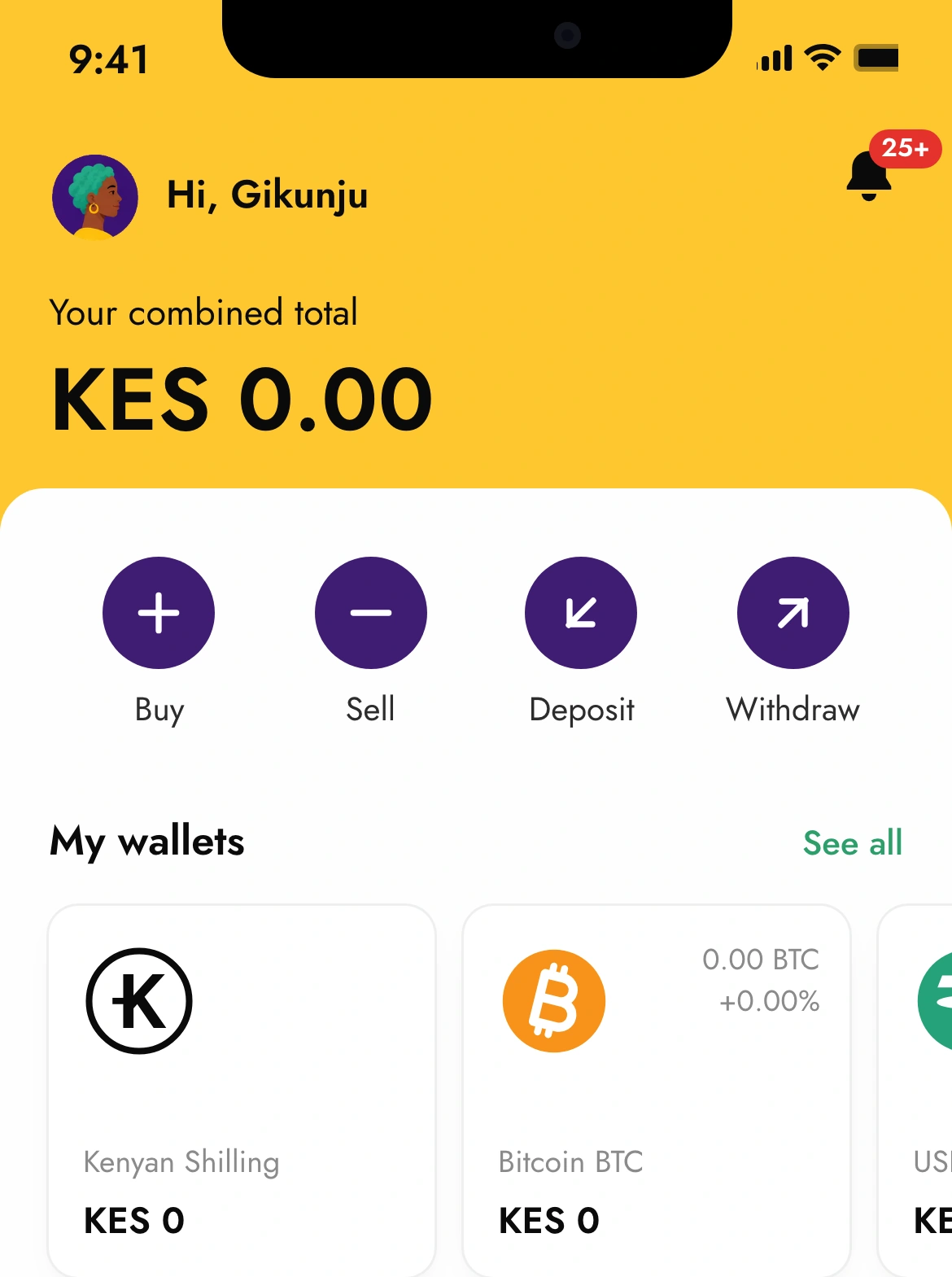
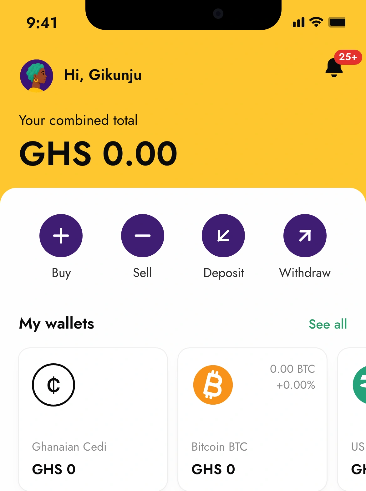
So the phone, identity and security steps are byte-identical for every market, and the welcome is the one screen that is not. Kenya gets Jambo. Ghana gets Akwaaba. Markets without a written welcome get the same warm sentence in English. Behind the screen the same market sets the currency the account opens in, so the home screen a Ghanaian lands on is in cedis without anyone choosing cedis.
It is a small thing in the scope of a redesign. It cost almost nothing to ship, because the structure had already paid for it, and it is the thing customers mentioned. A fix to the phone step is a fix in every market at once, and a Ghanaian still gets greeted in Ghana.
One flow, and the one screen that knows where you are.
edge cases
- a market outside the four here
- the flow carries every market Yellow Card operates in. kenya and ghana have their own welcome line; the others share the generic one.
- a foreign sim
- the dialling code sets the market, so a kenyan with a uk number gets the generic welcome and a uk configuration. the earlier flow asked for residence explicitly. see the reflection.
- an invalid date
- day is two digits, month and year are pickers, so an impossible date cannot be typed; whether the combination is a real date is checked at verification, not here.
- a weak password
- next stays disabled until all five rules read as met. the rules are visible before typing starts, so the customer never discovers them one rejection at a time.
- no email
- the email is required, because it is the only recovery path for a phone-number login. it is the one field on the security step that is not about the password, and the sentence above it says why.
- a referral code
- behind a link, so the field only exists for people who have one. it never blocks.
- going back
- the three steps have no back arrow; the earlier flow had one. going back is leaving, and the phone number brings you straight back to where you were.
what we measured, and what it can say
Two numbers I tracked and one I watched. Time to complete and drop-off were the ones the redesign was aimed at; consistency across markets was the guardrail. A fix that worked in Kenya and broke Ghana would not have counted, so the numbers below are across all markets together, by design.
Window and cohort: time to complete and conversion for the new flow against the previous one, measured across all markets together rather than market by market; the period and cohort sizes were not kept, so they are not claimed here.
how it was measured, and what it does not prove
- measured
- median time from the first step to the welcome, new flow against the previous one
- against
- the previous four-step flow, across all markets together
- why it mattered
- it was the number the redesign was aimed at: the old flow was long and its steps felt disconnected, and time is what both of those cost
- does not prove
- which change did it: phone-first, the dropped country step, the grouping and the white ground shipped together
how it was measured, and what it does not prove
- measured
- the share of people who started the flow and reached the welcome
- against
- the previous flow
- why it mattered
- faster is only worth something if more people finish
- does not prove
- that they went on to verify or deposit; onboarding ends at the welcome
how it was measured, and what it does not prove
- measured
- support tickets about getting stuck during sign-up
- against
- the period before release
- why it mattered
- it was the signal that the confusion the research found had actually gone, not just moved
- does not prove
- a number: the count was reported as a drop, not a rate, so it is not one here
what kind of number each one is
open the definitions
- task performance
- how long the flow took. the cleanest of the three, and the one the design was aimed at.
- behaviour
- what people did: finished, or wrote to support. real, but each shipped alongside everything else that changed.
- not measured
- drop-off per step per market, and whether people who finished faster understood what they had agreed to. the reflection says which of these I would instrument first.
The number that mattered most to me was not the conversion. It was that the same flow held up in Kenya and Ghana and Nigeria at once. That is the claim the one-branch structure makes, and the all-markets number is the closest thing we had to a test of it.
It is also the number’s weakness. An average across twenty markets can rise while one of them falls, and we could not see that. The reflection says what I would instrument first.
what this changed, and what would change it back
The assumption that changed. I went in believing simplification meant fewer fields. The old flow did ask for too much, too early, and the count did come down. But the change that made the flow feel simple was not a removed field. It was deciding which complexity belonged to the customer and which the system should absorb. The country is the clearest case: the customer stopped answering a question the phone number had already answered.
What it taught me about localisation. Localisation is a decision you make at the start, and mostly it is a decision about where the branch goes. Put it early and you fork the whole flow; every fix has to be made twenty times. Put it at one point near the end and the flow stays one flow, and the market still gets its own welcome. The warmth people noticed was cheap because the structure paid for it.
Not the same outcome. A flow that is 23% faster is not a flow that is 23% better understood. Speed can come from people skipping optional fields they should have filled, or from the shorter path hiding a step they will hit later at verification. The time number is real; what it says about comprehension is limited.
What I would measure earlier. Drop-off per step, per market, from the first day. One number across twenty markets says the average moved. It cannot say whether Ghana moved for the same reason Kenya did, and the whole premise of the design was that they might not.
What is still unclear. Whether the dialling code is the right proxy for the market for everyone. Diaspora customers, people with a foreign SIM, and anyone who moves between markets get the wrong welcome and possibly the wrong configuration. The flow assumes phone and residence agree; the earlier flow, for all its faults, asked.
what would make me move the branch
open the list
- per-market drop-off, once instrumented, shows one market falling while the average rises: that market gets its own step order, and the one-branch rule gets a second branch.
- support tickets show people with foreign numbers landing in the wrong market: residence comes back as a question, but after the phone step and pre-filled from the code, so most people confirm rather than choose.
- compliance in a market requires a field at sign-up that others do not: it is added to that market's identity step only, as a configuration, not a fork; if that happens in more than a handful of markets, the shared identity step stops being shared.
- verification drop-off rises after release: the speed came from deferring work rather than removing it, and the identity step takes some of it back.
one branch, at the end, is a bet that the markets differ in their welcome more than in their requirements. any of these would mean the bet is not paying.
try it
Sign up from a different country. Watch what changes.
Create an account with a Kenyan number, then do it again with a Ghanaian one. The three steps will not change. The welcome will, and so will the currency the home screen opens in.
things worth trying, in order
Things worth doing, in order:
- Create free account, tap the code and pick a country
- type a number, then a name and a date of birth; try leaving the nickname empty
- type a password and watch the rules
- open Help? on any step and come back
- finish, then use the buttons below to start again from another market, or to see the earlier flow