Bathmate

Bathmate makes products for men’s sexual health. It’s a category most brands treat as either clinical or crass. Bathmate wanted to be neither. I led a full brand evolution across visual identity, photography direction, tone, and UX to get there.
The brief was specific: keep it masculine and trustworthy, but make it actually approachable. Men don’t casually browse erectile health products. They arrive with hesitation already baked in. The brand needed to work with that, not against it.
the problem
The existing brand leaned hard into aggressive masculinity. Bold copy, loud headlines, confidence everywhere. It worked for customers who were already convinced. For anyone on the fence, it just added friction.
Erectile dysfunction carries real stigma. The brand wasn’t addressing that. It was ignoring it. Every touchpoint needed to shift from “this is a powerful product” to “this is a brand that actually understands you.”

what we learned
We ran user research across current and potential customers. The same things kept surfacing. Users wanted information without feeling lectured. They needed social proof before they trusted anything. And the visual heaviness of the old brand made them feel judged rather than supported.
The ask wasn’t to make it softer. It was to make it smarter. Confidence reads differently when the copy is empathetic and the imagery actually respects the person looking at it.
redesigning the brand
The color palette stayed anchored in what Bathmate already owned, but we dialed back the aggression. Typography got cleaner. Imagery shifted toward real photography that felt more human. The direction: masculine, but composed instead of loud.
I ran the visual direction across every surface: web, packaging, and marketing. Consistency mattered here. A customer who finds Bathmate through an ad and lands on a product page should feel the same brand at both ends.
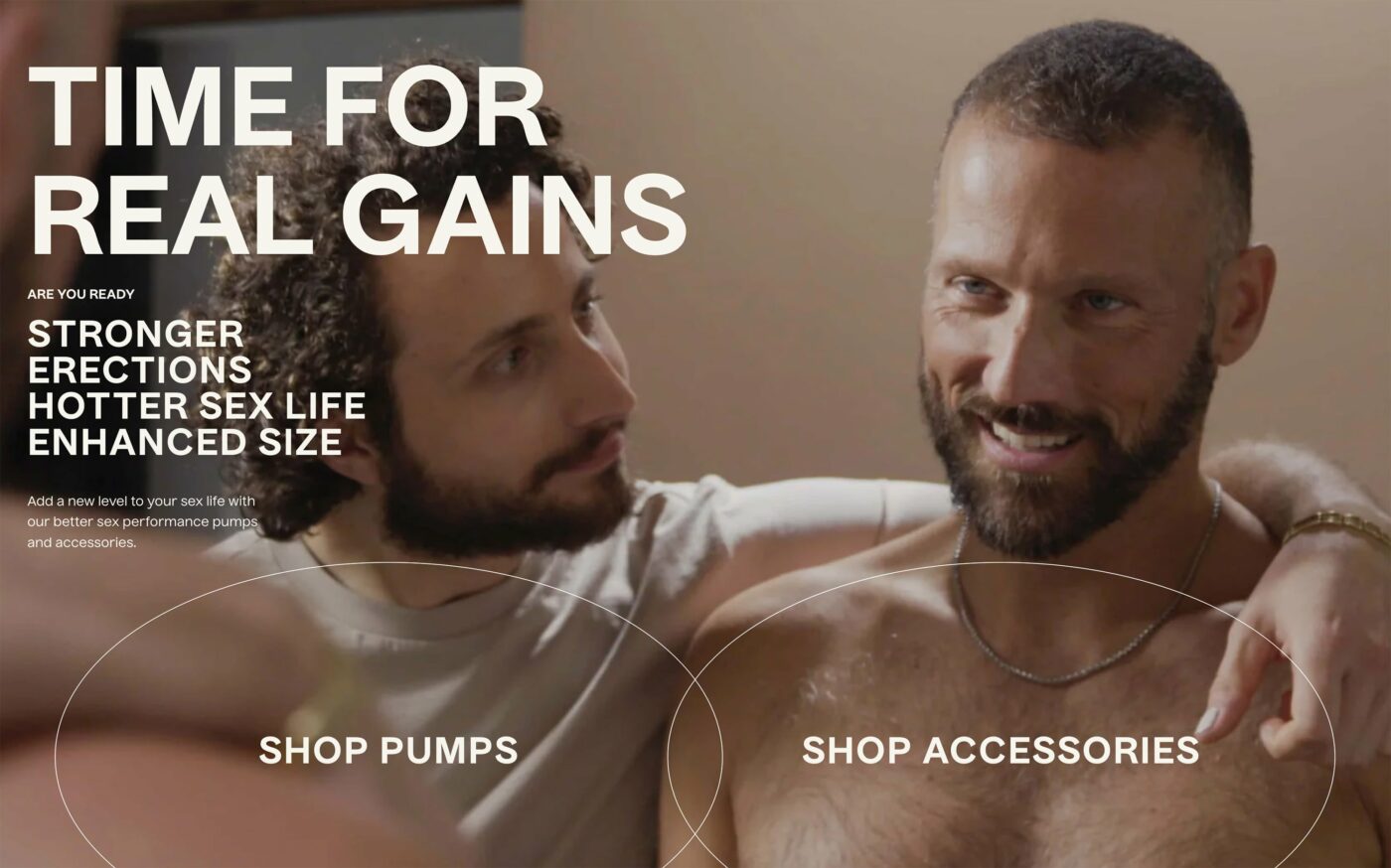
the photography direction
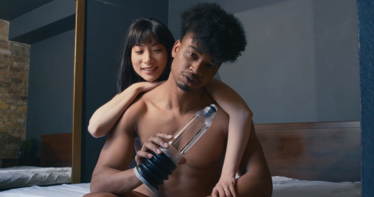
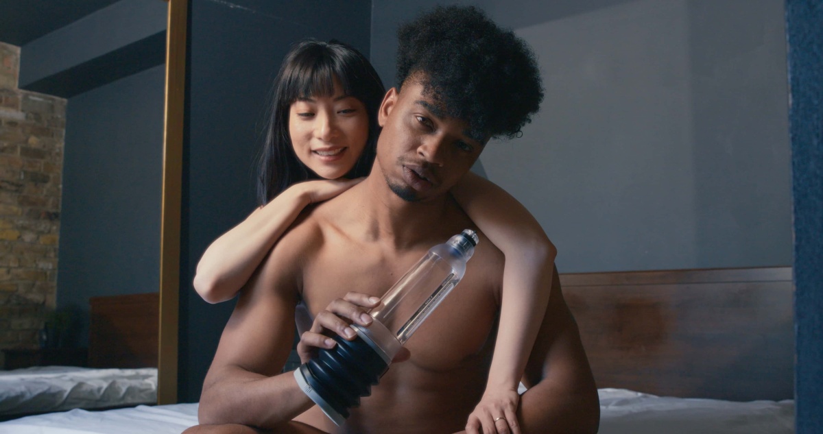
Photography was doing the most damage. The old imagery felt like stock photos selected by someone who’d never actually spoken to a Bathmate customer. We commissioned a full lifestyle shoot with a completely different brief: real couples, real spaces, warmth over performance.
The new photography had to make the product feel like a normal part of an intimate life, not a clinical tool or a gym supplement. That shift in visual tone changed how every page felt.




getting the tone right
Copy is everything in this category. The wrong word in the wrong place breaks trust instantly. I worked with content strategists to rewrite the brand voice from scratch: informative, direct, human.
The tone had to walk a line: take the subject seriously without being heavy about it. Users needed to feel seen, not diagnosed. That balance took a lot of iteration to get right.
the product pages
Product pages were carrying most of the conversion weight. The old versions were dense with claims and light on actual information. We restructured them to lead with education: what is this, how does it work, who is it for.
The Extreme range got a full page treatment. The pumps category needed a clear way to help customers find the right product for them without feeling overwhelmed by SKUs and specs.


the selector and sizing
One of the biggest UX problems was that customers didn’t know which product to buy. The selector flow needed to guide without embarrassing. Questions about body size are personal. The UI had to feel matter-of-fact, not clinical or awkward.
The sizing guide went through the most iteration. We tested the language extensively. “Find your fit” outperformed everything that tried to be clever or too direct. Simple won every time.
navigation and browsing
The nav was an afterthought on the old site, a long list of categories that assumed you already knew what you were looking for. We rebuilt it around intent: what is someone actually trying to do when they open this menu.
The new navigation made it easier to browse by goal rather than product type. Someone looking for information ends up in a different place than someone ready to buy. The site needed to support both paths without making them collide.
the full site
The final rollout went across the Bathmate website, product packaging, email campaigns, and marketing materials. We ran usability testing throughout to make sure the new identity held up with real users, not just in design reviews.
Stakeholder alignment was a big part of this. Marketing, leadership, and the content team needed to buy in at different stages. I ran workshops, presented research findings, and iterated based on feedback before we locked anything.

the results
Engagement rates climbed. Landing pages saw longer session times. Post-launch feedback showed a stronger emotional connection with the brand. Users reported feeling more comfortable engaging with the content, which is the hardest metric to move in a category like this.
Conversions went up. The new brand positioning reduced hesitation among new customers and made the purchase decision feel less fraught. That was the real win.
My hypothesis going in was that softening the tone would move people from browsing to buying without making the brand read as generic or less confident. So alongside conversion, I kept an eye on brand-perception feedback as the guardrail. Post-purchase survey scores on "the brand feels like it gets me" held at 4.6 out of 5 even as conversion improved, if that number had slipped while conversion climbed, it would have meant we’d traded personality for politeness, and that wasn’t the trade I was trying to make.

what i’d take from it
Emotional intelligence is a design skill. Working in a sensitive category forces you to think about who is actually on the other side of the screen and what they’re feeling when they get there. That kind of empathy sharpens everything: copy, visuals, flow, hierarchy.
Bathmate didn’t need to pick between bold and approachable. It needed both at the same time. That balance is harder to get right than it sounds, but when it lands, users feel it.