Yellowcard

Yellowcard operates in over 20 African countries. Each one has its own language, currency, trust norms, and relationship with financial services. The challenge was designing one onboarding flow that worked across all of them, without feeling generic to any of them.
The old flow had too many screens, no localization, and nothing that made a new customer feel like the product was built for them. We redesigned it from scratch, and time to complete dropped 23% across all 20+ markets at once, not market by market. This is what changed and why.
the problem with the old flow
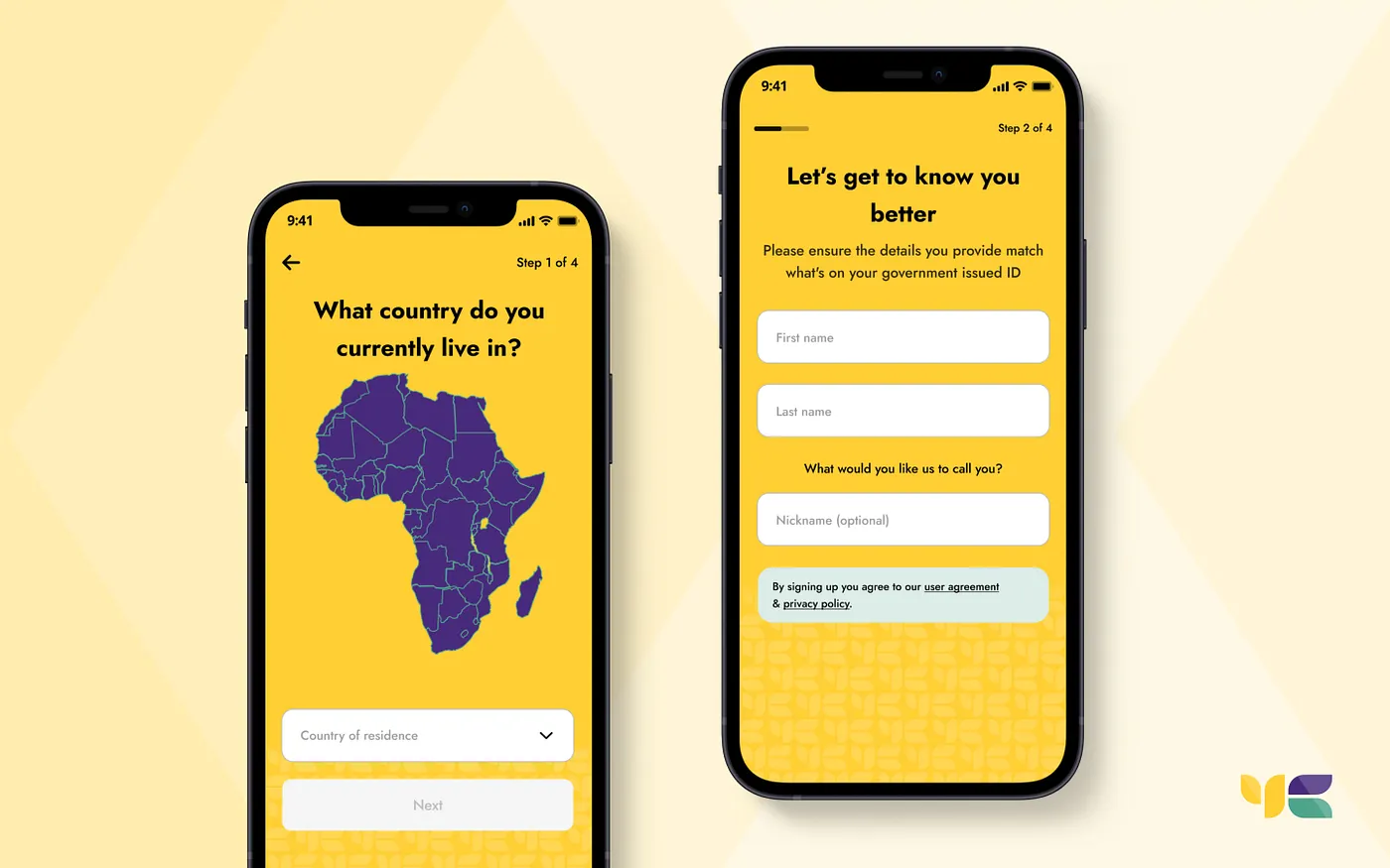
The original onboarding took customers through too many screens and asked for information in the wrong order. Phone number came too late, which meant people who meant to log in were already three steps deep before realizing they were on the wrong path. The visual design leaned hard on yellow, which felt busy and added cognitive load at exactly the moment a new customer needed clarity.
It also had no localization. Every market got the same flow in the same language with the same tone. For a product built on financial inclusion across 20+ African countries, that was a miss. We needed an experience that felt like it knew where you were from.
listening first
Before touching anything in the design, we ran usability testing, gathered survey data, and went through support tickets to find the patterns. The research flagged the same things repeatedly: the flow was confusing, the steps felt disconnected, and customers in different markets didn't feel like the product was designed for them specifically.
That last part drove everything that came next. The redesign wasn’t just about making onboarding shorter. It was about making it feel like a warm welcome, not a compliance checklist. My hypothesis was that fixing the phone number order alone wouldn’t move the needle, the visual load had to drop too, so I tracked time-to-complete and drop-off by market as the numbers that mattered, and consistency across markets as the guardrail. A fix that worked in Kenya but broke in Ghana wouldn’t have counted as a win.
what we changed
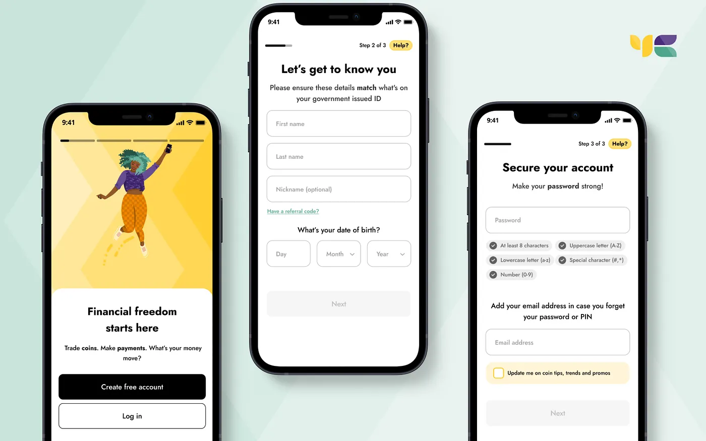
We reordered the steps so phone number came first, catching the "meant to log in" drop-off early. We grouped related fields together using Law of Proximity: full name and date of birth on one screen, password and email on another. Each grouping had a logical reason, and customers could feel it even if they couldn’t name it.
The dominant yellow background became white. A colour theory workshop with our product illustrator surfaced what the data backed up: high cognitive load at sign-up was partly visual. White gave the flow room to breathe. New brand illustrations, a progress indicator, and contextual help appeared throughout so customers always knew where they were and how much was left.
localization as a design decision
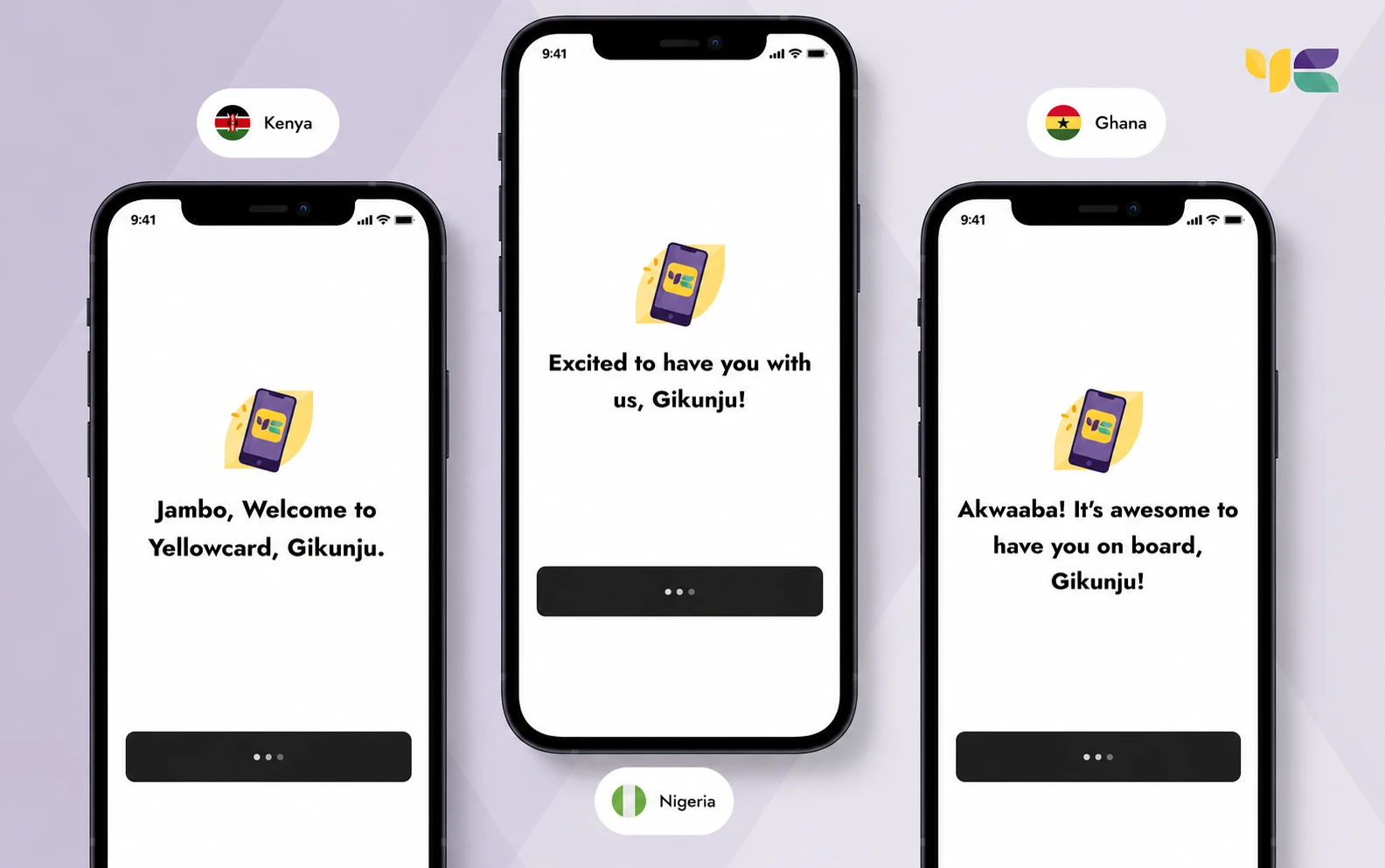
The thing I’m most proud of from this project is the localized welcome screens. When you finish creating an account, you get a greeting in the language and style of your market. Kenya gets Jambo. Ghana gets Akwaaba. Nigeria gets its own. It took a specific choice to make it happen and it cost very little to ship.
It’s a small thing in the scope of a redesign but it’s the kind of thing customers notice. Fintech products in Africa often feel like they were built somewhere else and exported. This was a deliberate signal that we knew who we were building for.
the results
Time to complete onboarding dropped 23%. Conversion went up 4.4%. Support tickets related to sign-up friction dropped. Customers flagged the new flow in feedback, not because it was flashy, but because it felt like it was made for them.
The metric that mattered most to me wasn’t the conversion number. It was that the redesign held up across markets. The same flow felt at home in Kenya and Ghana and Nigeria. That’s harder to do than it sounds.
what i’d take from it
Localization is a decision you make at the start. It shows up in every choice after that: copy, visual hierarchy, what you surface first, how you say welcome. Bolt it on at the end instead and it shows, every time.
The other thing: reducing cognitive load isn’t just about fewer steps. It’s about making each step feel obvious. The white background, the groupings, the progress bar. None of them are individually impressive. Together they made a flow that customers could complete without stopping to think.