LOOP Grotesque

LOOP Grotesque started as my own project, Guks. It was going into a fintech app that runs numbers at 9, 10, 11px, so I wanted something as clean as Suisse Int'l, but a bit rounder and a bit more spaced than Neue Montreal. Guks is the base grotesque everything else here builds on. My working hypothesis was that rounding the terminals would only read as friendlier if it didn’t cost legibility at 9px, so that became the actual guardrail: every pass got measured against real rendered digits, not eyeballed, which is most of what the rest of this page documents.
Turning it into the finished LOOP Grotesque became a longer exercise in how far you can push a rounded-terminal treatment before it stops being the same typeface, and how you actually prove you got it right instead of eyeballing it. The answer was to measure everything, trust nothing until it's rendered, and assume the first version of any formula is wrong. This is the record of that process: rounding, kerning, a look at Neue Montreal, and the mistakes I caught along the way.
why a custom font, though
Because you can just do things. I had some typography video playing in the background, one of those ultimate-guide-to-kerning uploads, more noise than anything I was actually watching, and somewhere in it I caught something about kerning tables and baseline grids and thought to myself: how hard could this possibly be? That's usually the wrong question to ask before starting something. It's also the only one that actually gets it started.
Full disclosure: Guks started from an existing grotesque, not a blank page. Rounded the terminals, rebuilt the kerning, kept going until it stopped reading as someone else's typeface. Whether that still counts as designing a font is a fair question. I'm calling it yes and moving on.
It's still not done. LOOP Grotesque is currently running in sandboxed iOS and Android builds, checking how it actually holds up in app UI instead of just on a specimen page. A typeface doesn't really finish. It reaches a point where you ship it and keep watching how it behaves.
tabular figures, and screens smaller than a phone
Fintech UI has one requirement most typefaces never bother with: numbers have to line up. In a standard proportional font, a '1' is physically narrower than an '8', so when a balance updates or a bill totals up live, the digits shift horizontally and the layout stutters under it. LOOP Grotesque uses tabular figures for every numeral in the family, every digit sitting in the same fixed width, so a number stacking on top of itself never jumps.
The other requirement came from where those numbers actually show up. Beyond the app, this also has to hold up on a PDQ terminal, the small merchant card-reader screens that run in every kind of lighting: bright sun at a food truck, a dim bar, a low-res display. A higher x-height and open counters, the negative space inside letters like a, e, and o, keep the letterforms from closing up and bleeding together at that size. That matters more on a two-inch terminal screen than it ever does on a phone.
the physical limit, first
Before touching a single glyph, I ran into a constraint, not a design choice. At body-text sizes there's barely a stem to round. A Regular stem at 14px renders at roughly 1.27 physical pixels. Round 20% of that and the difference is a fraction of a pixel. Not visible.
That reframed the brief. Rounding only reads as a visible feature above roughly 17px: display headings, large numerals, hero stat figures. Below that, sharp versus rounded isn't something anyone can perceive, no matter what percentage you dial in. So the radius had to be calibrated for where it's actually seen, not applied as one flat number everywhere.
rounding terminals, not glyphs
The rounding pass classifies every on-curve corner in the outline as convex or concave, from contour winding. Convex corners in a narrow angle band are stem caps and arm tips, open air, eligible for rounding. Concave corners are stroke-to-stroke junctions: crossbar meeting stem, arm meeting bowl. Those stay sharp, always.
That distinction comes directly out of outline topology. Joining a second stroke onto a silhouette always adds a reflex vertex; it can't create a new convex tip. I checked this against the raw coordinates of 't' before writing any rounding code. Crossbar tips and the top of the stem classified as convex, exactly as expected. The crossbar-to-stem junctions classified as concave. The geometry confirmed the model before a single line of code changed anything.
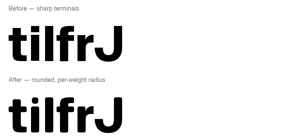 LOOP Grotesque rounding pass" loading="lazy" style="width:100%;height:auto;display:block;">
a real geometric ceiling
Radius targets later got collapsed from the app's actual type scale: each weight's radius set by its smallest rendered instance, since that's the hardest case to keep visible at all. Regular landed at a 46-unit target. But two fillets sharing the same 91-unit stem edge can each take at most about 45% of it before the curves cross into each other. That's a structural ceiling, not a stylistic one.
Regular clamps to 41 units no matter how high the nominal target goes above that. Short arms fare worse: r's arm and t's crossbar ends sit on edges as short as 9 units, capping near 4, effectively sharp by design. Full stems carry the visible rounding, short arms and hooks stay close to sharp. SF Pro Rounded's own r-arm makes the same tradeoff.
the dot, and a format gap
The i/j dot was the most rigid element in the whole letterform set: a perfect square, sharper than any stem terminal. It's now a true circle, matching the dot treatment I found later in Neue Montreal, applied consistently across every weight.
Separately, the Thin weight shipped as a CFF/PostScript outline, and the rounding pipeline only understood TrueType's quadratic curves. Converting cubic to quadratic with a dedicated conversion pen closed that gap instead of leaving Thin permanently unrounded. I rendered before and after to confirm the conversion didn't distort the letterforms.
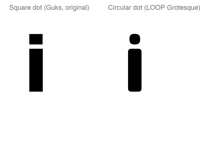
kerning against a reference, not a formula
A flat multiplier on Guks's original kerning table overshot SF Pro Rounded's own measured values on most stress pairs, sometimes by 2x. So I stopped guessing at a multiplier and measured SF Pro Rounded's actual per-weight kerning straight from its font files, and used that as the target.
One pair, Ko, broke every version of a shared-ratio approach. Its own weight-to-weight curve in the original font doesn't track SF Pro Rounded's at all, and no single ratio can represent a steep curve and a flat one at the same time. So Ko got pinned to SF's literal measured value instead of derived like the other eleven pairs. The final pass lands the full twelve-pair table roughly 10% tighter than SF's own reference. That overshoot is intentional and verified, not an accident of the math.
the mistakes worth naming
- A "48/48 exact match" kerning audit that was actually tautological. The values had been hardcoded to the reference, not derived from it, so of course they matched.
- A GPOS kerning scan that silently skipped every pair wrapped in an ExtensionPos indirection layer, common in larger fonts.
- A proposed radius-halving formula with an inverted sign, landing looser than the reference instead of tighter, caught by plugging in one real number before trusting the algebra.
None of these were visible from the code alone. Each one only surfaced by rendering the actual output and measuring the actual coordinates, not by re-reading the logic. The method, from there on: never report a number without pulling it from the real file first.
checking it against neue montreal
Neue Montreal was the reference for the whole brief, so partway through I measured LOOP Grotesque directly against it: different stem widths, different x-height, four real italic styles, its own kerning table. Its terminals came out sharper than LOOP Grotesque's, not rounder, which is what a bit rounder than Neue Montreal was supposed to look like. The only genuinely round thing about Neue Montreal itself was a dot design in three of its six weights, inconsistent across the rest.
Fabricating Neue Montreal's stem widths on top of my own geometry would have been a much riskier move than anything else here, closer to real type design than a script edit. So instead I ran the same rounding and kerning pipeline directly against its own files, as a check. A quick mechanical stem-width test on a handful of simple glyphs confirmed the direction was right, without pretending it was a shippable result.
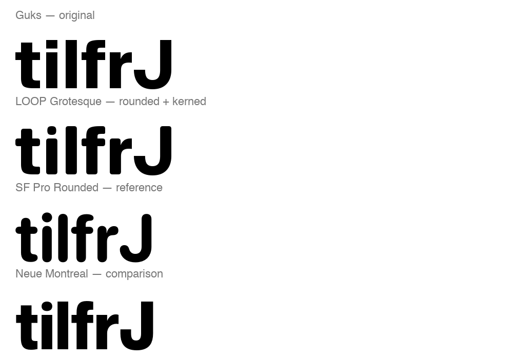 LOOP Grotesque, SF Pro Rounded, and Neue Montreal compared side by side" loading="lazy" style="width:100%;height:auto;display:block;">
tabular figures didn't fix '1'
Tabular figures fix one thing: every digit gets the same advance width, so a live-updating balance doesn't jitter when it changes. That doesn't fix what's inside the width. Center each digit's ink in the same box and most of them land close enough together that nobody notices. '1' is a bare vertical stroke, a fraction of the ink the other nine digits carry, so once it's centered in the same box as '0' or '8', its own sidebearing can run two to five times theirs.
That showed up first as a visible gap sitting around '1' on its own. Then as something that looked like a collision: the period landing right against seven's diagonal stroke in a rendered "-377.00". Closing the first gap was a kerning fix. Diagnosing the second one took longer than fixing it, because the actual cause turned out to be somewhere else entirely.
a foot serif, three times, none of them right
The obvious fix, and the one Suisse Int'l's own tabular figures actually use, is to draw '1' with a base, so it isn't a bare stroke competing against nine drawn shapes. First attempt widened the stem symmetrically, same amount on both sides. It fixed the sidebearing math and looked heavy doing it, especially at Bold, where the added foot read like a different weight sitting under the numeral.
Second attempt copied Suisse's actual outline: their foot only extends on one side of the stem, not both, a real measured detail in their font rather than a guess. On LOOP Grotesque's own flag shape it turned '1' into something closer to an L. Suisse's asymmetric foot balances against their own flag, not this one. Third attempt went back to symmetric with a smaller ratio, lighter, but there was still a stem sitting under the numeral that hadn't been there before, and it still read wrong. Reverted all three. '1' is a plain stroke again.
a renderer that had been lying
Every kerning change in this project got checked by rendering it and looking at the result. Partway through the digit work, checking whether the renderer actually applies kerning at all turned up a real problem: no HarfBuzz-based text layout installed, so every pixel comparison up to that point had rendered base advance widths only, with the kerning table silently ignored. Two test images that looked visibly different from each other, built from two different kerning values, turned out to be rendering the exact same, unkerned string both times.
Installed a proper HarfBuzz binding to shape text the way a browser or a design tool actually would. Every check after that point measured kerning that was really being applied, not a renderer's guess at it.
two bugs sitting under the kerning tables
One line decided whether a scanning function treated a GPOS subtable as direct pair kerning: checking for an attribute called PairValueRecord. That attribute lives on a nested PairSet, not on the subtable itself, so the check was always false. It had been silently skipping every direct-format kerning pair across four separate functions for the whole project, with no error anywhere, because nothing had needed those specific pairs before now.
Second bug: a glyph left out of a kerning class list still belongs to an implicit class 0, and class 0 in the original font wasn't neutral. '8' was never explicitly classified anywhere, defaulted to class 0, and inherited a real kerning value against the period that my own scan missed, because it only checked glyphs named directly in the class table.
mirroring suisse, properly this time
The actual fix came from measuring digits the plain way: each one's own overall bounding box, not a near-baseline zone I'd invented earlier to catch seven's diagonal. That invented measurement is what made '7' look like a severe outlier in the first place. By the plain measurement, '7', '9', and '3' already sit in a tight, natural range against a period, the same range they'd have with no kerning at all.
Suisse Int'l's own tabular figures confirm it: zero kerning between any digit and punctuation, for all ten digits. Every digit besides '1' gets that same treatment now, no kerning, natural spacing, because it already looked right. '1' still needs a correction, since the letterform fix that would have made it unnecessary didn't survive contact with the rest of the family. One exception, not the rule.
a comma inside a descender
A comma sitting inside y's descender turned out to be the same multiplier bug from the digit work, just never checked outside the numerals. 'y' plus comma had a real, designer-set kerning value of -115. Scaled by the project's 1.85x tightening multiplier, it became -213, enough to put the comma inside the curve of the descender.
Checking how far that went turned up 474 letter-vs-punctuation pairs in the font, nearly the whole alphabet plus diacritic variants, every one scaled by the same multiplier meant for stress pairs like A-V. Several were already tight by design (question plus comma at -160, Y plus comma at -140), one scaling pass away from a real collision. Fixed by excluding every pair kerning against comma or period from the multiplier entirely, keeping them at their original, designer-set values instead.
a real audit, not a spot check
Fixing 'y' plus comma raised the obvious next question: what else clashes that nobody's looked at. Answering it meant checking actual ink overlap, not bounding-box math, since this project had already proven bounding boxes lie in both directions. Built a scanline check instead: sample the vertical range two adjacent glyphs share, and at each sampled height, measure the real gap between their outlines.
Ran it across every ordered pair of letters, digits, and punctuation, about 5,800 combinations per weight. Found dozens more pairs broken by the same multiplier issue. Found two, 'A' plus 'x' and 'Q' plus 'X', that collided even at their original, un-multiplied value, a pre-existing issue the multiplier had nothing to do with. And found 'F' plus 'T', which had no kerning entry at all, just naturally sitting 0 to 6 units apart in most weights. A pair with nothing in the kerning table isn't a pair that's fine, it's a pair nobody's checked.
the fix that broke what it wasn't touching
The first version of the fix wrote the corrected value straight into whatever kerning record it found. That worked until comma plus 'X', which had been sitting at a perfectly fine 102-unit gap, turned up broken at -58, overlapping, right after a totally unrelated pair got fixed.
Class-based kerning groups many glyph pairs under one shared value. Overwriting that shared cell to fix one pair silently changed every other pair using it, comma plus 'X' included. The real fix: never write into an existing kerning cell, add a small corrective lookup carrying only the exact amount one specific pair needs, layered on top instead of overwriting anything. Re-ran the full audit after: zero flagged collisions, and comma plus 'X' back to its original 102-unit gap.
one fix undoing another
"11." rendered with a gap between the two ones wide enough to read as two separate numbers. The correction for '1' against every other digit was already in place and correct. '1' against itself wasn't, because one function's fix was quietly cancelling another's.
A pair-cleanup step written earlier in the project didn't know a later step had started handling '1' plus '1' on its own, so it kept "neutralizing" that pair back toward zero the moment the real correction landed. Two correct pieces of code, run in sequence, produced a wrong result neither one would have produced alone. Fixed by teaching the cleanup step what the newer one already owned.
auditing what wasn't asked about
Finding that bug meant checking every digit against itself, not just against '1'. All nine came back fine, ordinary gaps, nothing close to a collision. Widened the check further: 'l' against 'l', 'i' against 'i', capital 'I' against itself, the narrow bare-stroke letters most likely to repeat the '1' problem in real words like "will" or "million."
Those numbers looked alarming on their own, a gap of 60% of the letter's own width, until checking Suisse Int'l's equivalent pairs turned up the identical figure, down to the unit. Ordinary behavior for a narrow stroke, not a defect: confirmed by the same reference this whole kerning pass has been checked against throughout, not just assumed safe because nothing looked broken.
the tool that made this possible
Every claim in this process got checked against a live, local HTML specimen page: every weight of every family side by side, a live-editable comparison, a terminal-detail closeup, and a full kerning table, all reading directly from the actual font files via @font-face. Numbers in a table can be wrong in ways a rendered glyph can't hide.
The specimen grew a family at a time: Guks, LOOP Grotesque, SF Pro Rounded as an outside reference, and Neue Montreal. Every number traceable back to a file on disk.
what i’d take from it
Type design compresses badly into intuition. A radius that looks right at one weight clamps invisibly at another. A kerning value that looks tighter can secretly be looser than where it started. The only way through was refusing to accept a claim, mine or anyone else's, without pulling the real coordinates first.
That caught real bugs before they shipped, more than once: a tautological audit, a skipped GPOS layer, an inverted sign in a formula. It also meant slower answers along the way, "let me verify that" instead of "done." Worth it every time a claim turned out to be wrong.